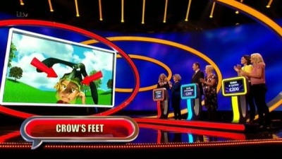
This is Catchphrase and its a quiz game show. The set is brightly lit and its clear so the audience can see. There are also little lights at the top of the stage and those one can change colour depending on the mood. The set has red, blue, purple and yellow lighting. It has a black background but everything else has colour which stands out from the background.
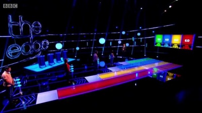
This is the edge, the set design of this is that it has circular lights and its colourful. The background is is dark and there's square shapes and rectangle. There's a stand for where the contestants stand and there's a line that goes around the studio.

This is tipping point and the set is brightly lit, its easy to identify emphasis and its quite simple. It mainly focuses on the contestants and the presenter. It has circular lights and a big purple square around the tipping point machine which makes the audience to focus just on that to create tension. There's yellow lights in the background which moves everywhere in the back.

This is the cube and the set is mainly dark. There's red colors and that can create tension and can be intense for the audience. This can put pressure on the contestant as the colours are quite dark and gloomy and quite mysterious.
You have made a good attempt to analyse how the use of set design including colour is designed to affect the audience.
ReplyDeletePlease add pages for 'research', 'pre-production', 'production', 'post-production' and 'evaluation'. Then add some postings for the TV production work we have been doing including TV game show history, job roles, running orders, start work on your case study too (see assignment brief on study space)
Good and balanced analysis
ReplyDelete